Ad Campaign
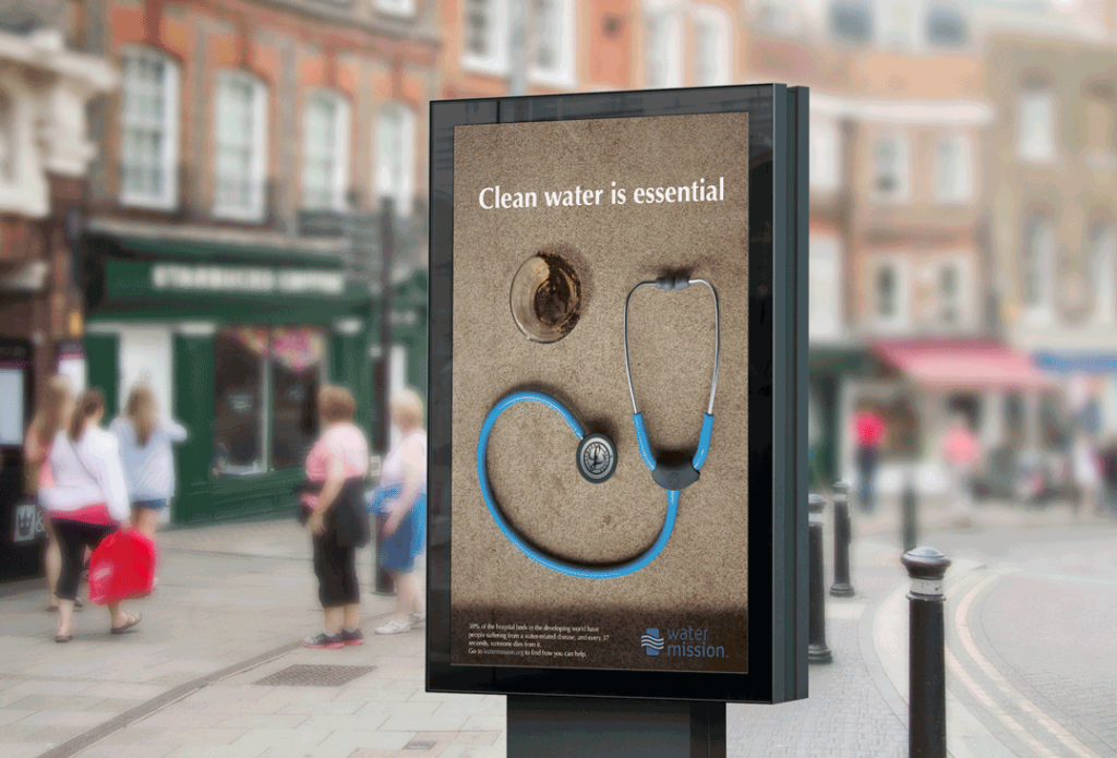
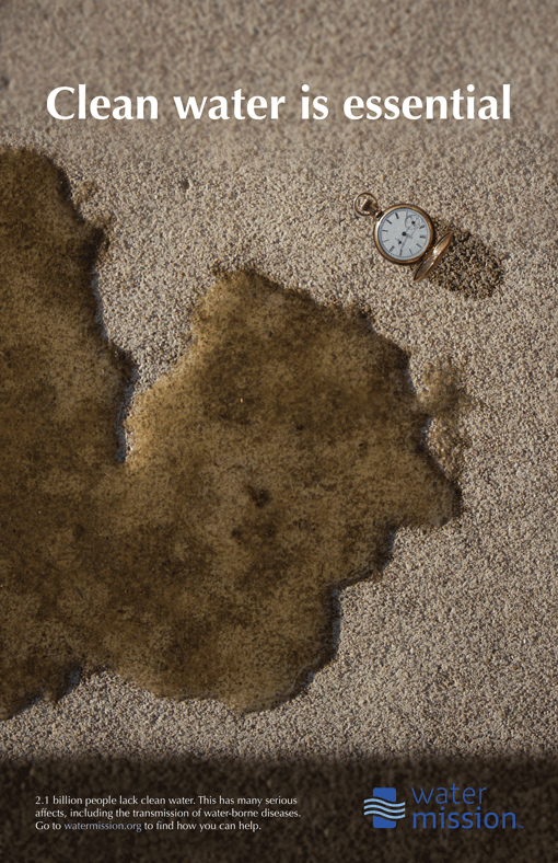
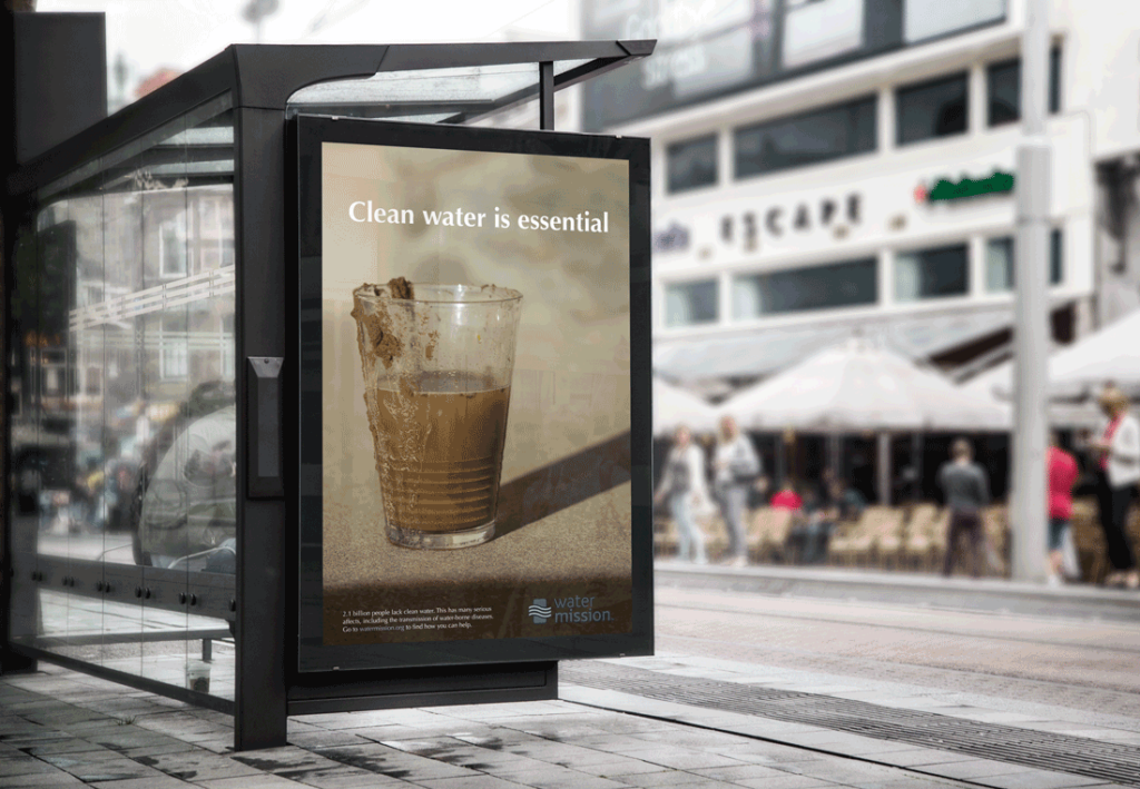
This campaign was to bring awareness to the global water crisis. Water Mission is an organization that works to bring clean water to people. The goal of this project was to create three different posters with the same phrase, but with different images. Besides the image of dirty water, I used elements such as the watch and stethoscope to illustrate some of the ways dirty water impacts people. The white text stands out against the predominantly brown background, presenting the idea of cleanliness. As part of this project, I also created an infographic about the global water crisis. All photos were taken by me.
Magazine
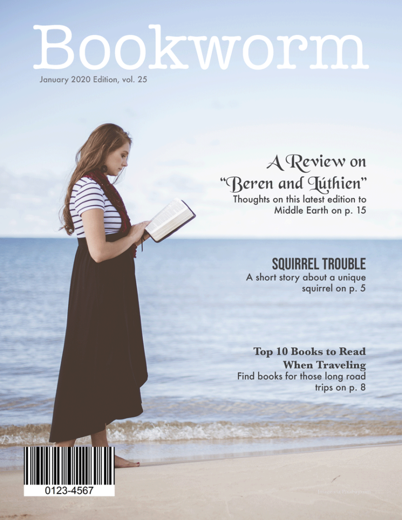
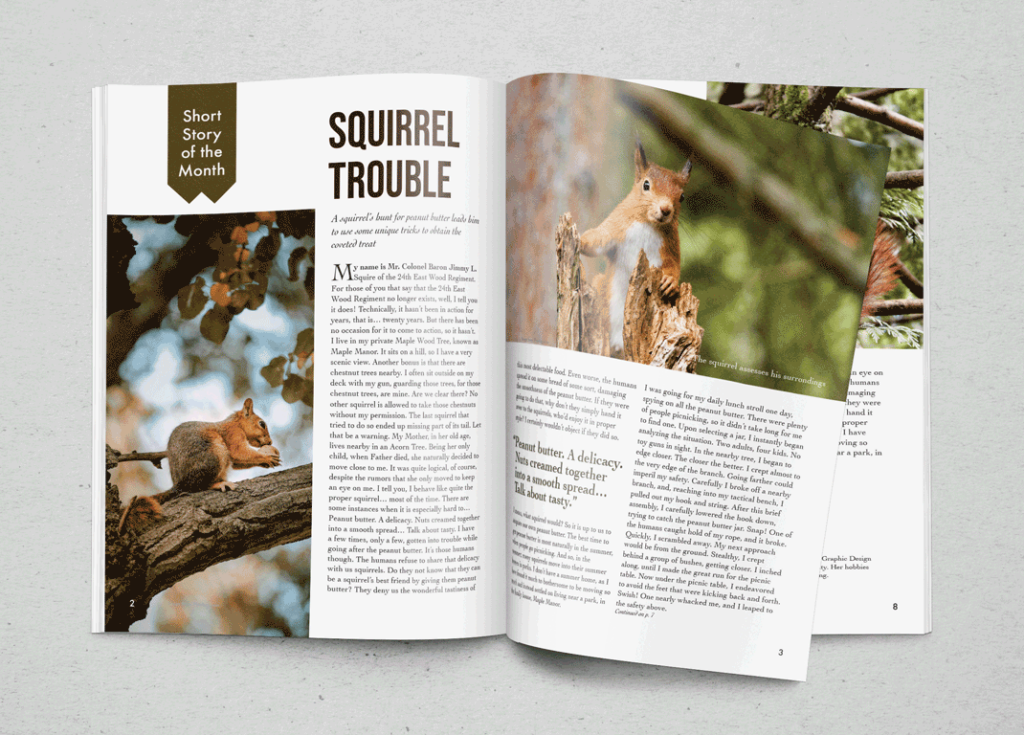
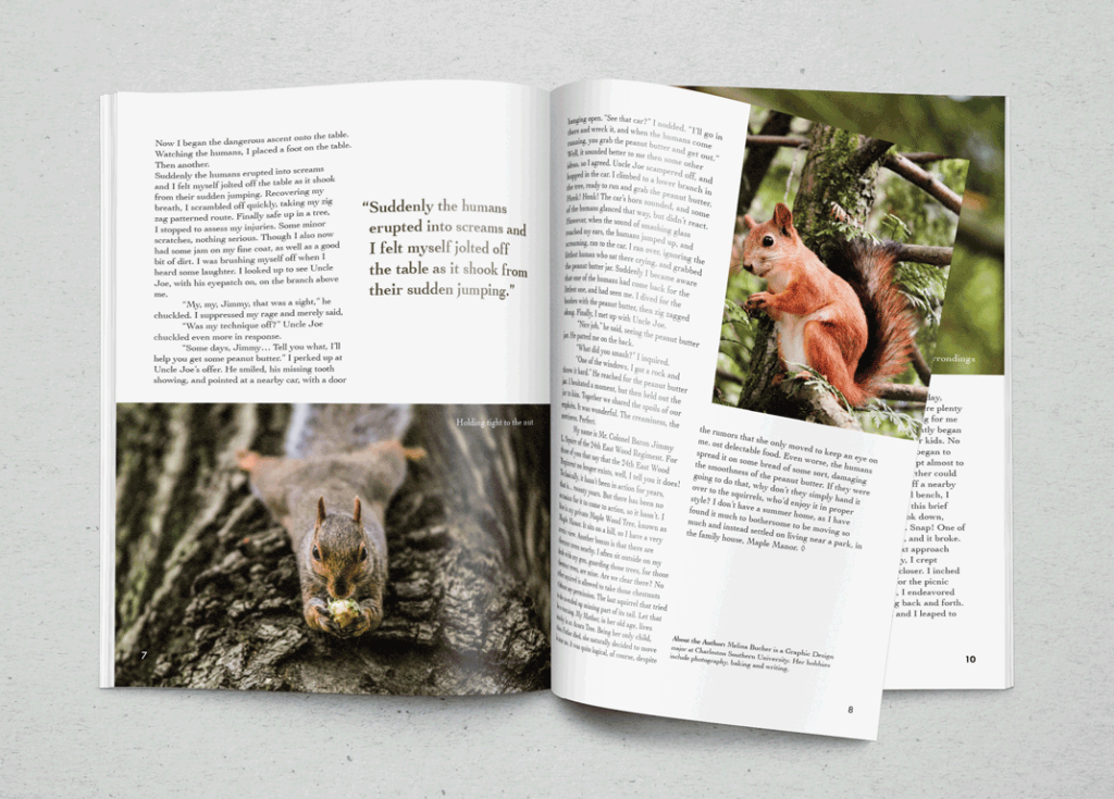
Bookworm is a magazine concept. I created two spreads for a short story which the story of a squirrel who deeply loves peanut butter. I found various squirrel photos that capture some of the mischievousness of squirrels to use for images. I used the colors from the images for some of the text to make it more appealing. I chose to use a serif for the body text, which fits well with the book theme, and then used a sans serif for the title to contrast with it.
Type Specimen Poster
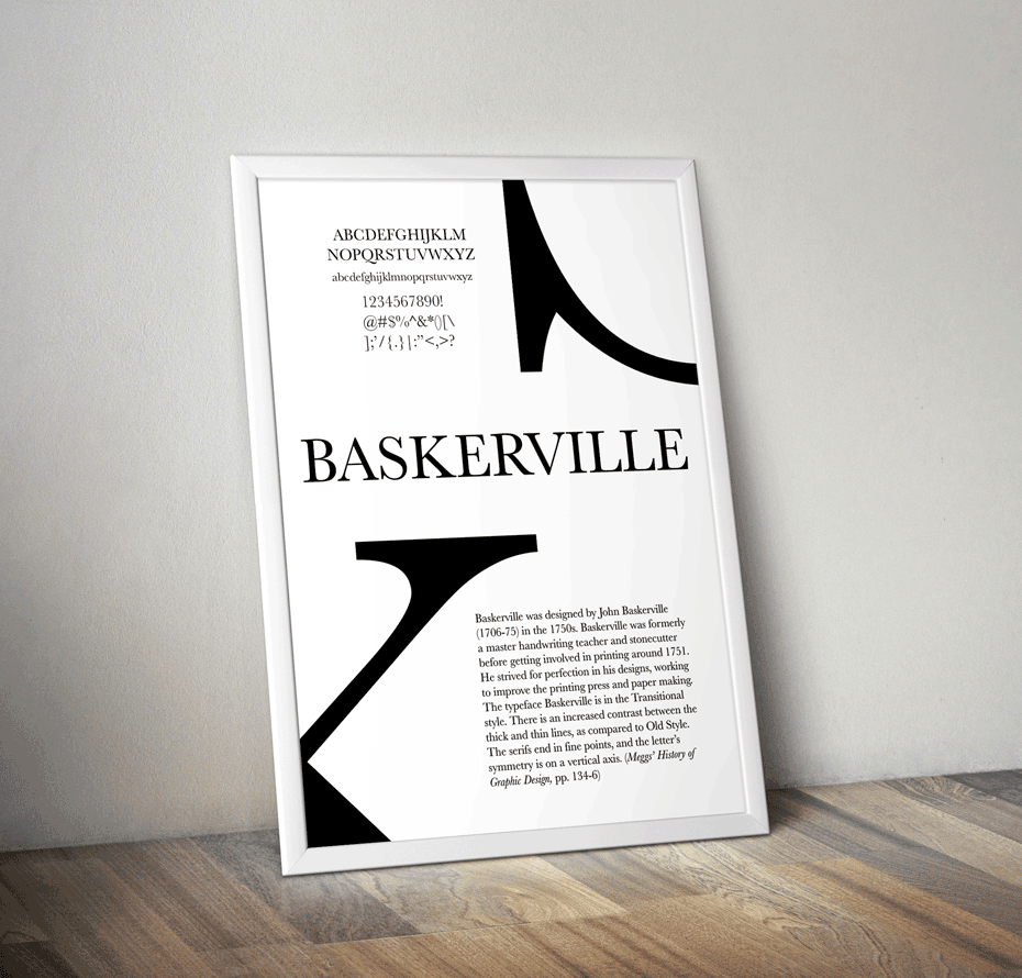
Baskerville is on of my favorite typefaces, so I chose to make a type specimen poster for it. I kept it fairly simple, with examples of what it looks like, and a paragraph about John Baskerville, the creator of it, and the typeface itself. I took the one serif end of a ‘k’ and and another letter (both in Baskerville), and enlarged them so that the the focus would be more on their form than their identity as letters. This allows the simple elegance of the typeface to be emphasized. It also provides some interesting lines and shapes in the poster to help draw people in.
Brochure for Mount Gretna Art Show


For this, I created a mock brochure for the Mount Gretna Outdoor Art Show. This is an art show located in central Pennsylvania that showcases the work of various artists. I was challenged with this to use only text to create the brochure, with no illustration or photos. I chose an interesting serif typeface to help convey the creative and artistic nature of the event, and then paired it with a simpler sans-serif.
Magazine Ads
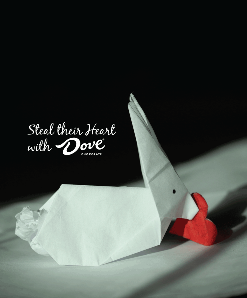
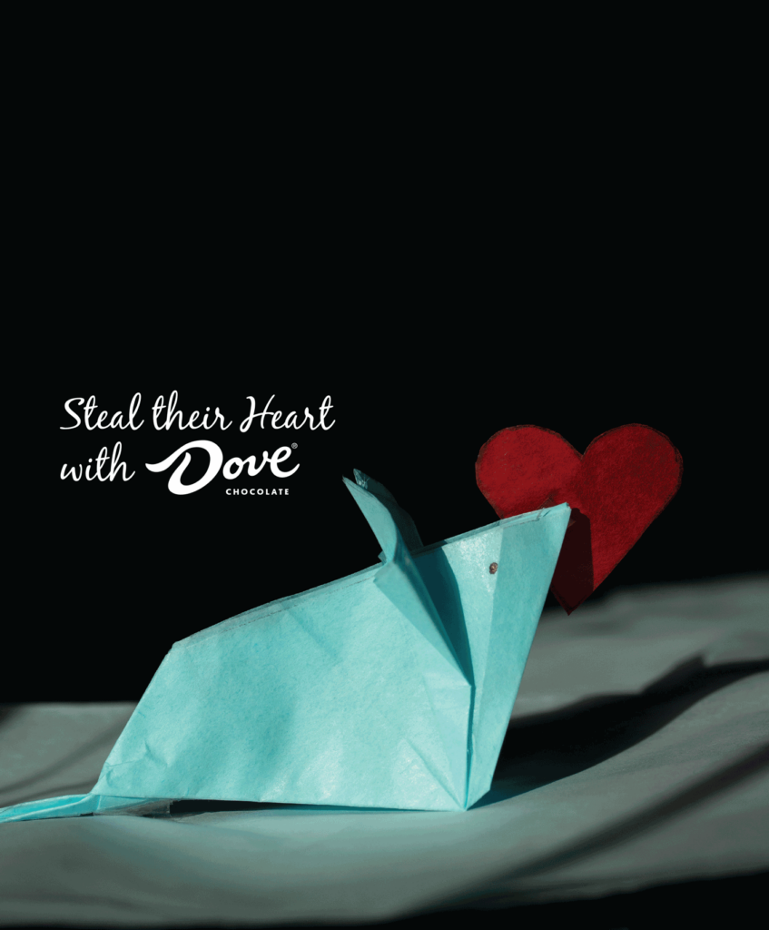
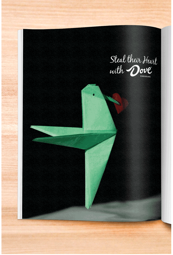
I was challenged to create an ad that didn’t include the product (Dove Chocolate) itself. For this, I took some tissue paper and made origami animals: a hummingbird, rabbit, and mouse. I then cut out a heart and attached it to the origami animal so it looked like it was carrying it. I wanted to convey the idea that they can win someone’s heart with chocolate, as the slogan illustrates. One challenging thing was getting the bird to appear to be flying. I had to dangle it from a piece of string.
Menu
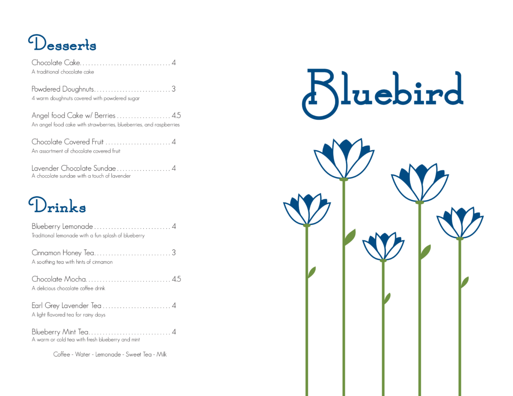
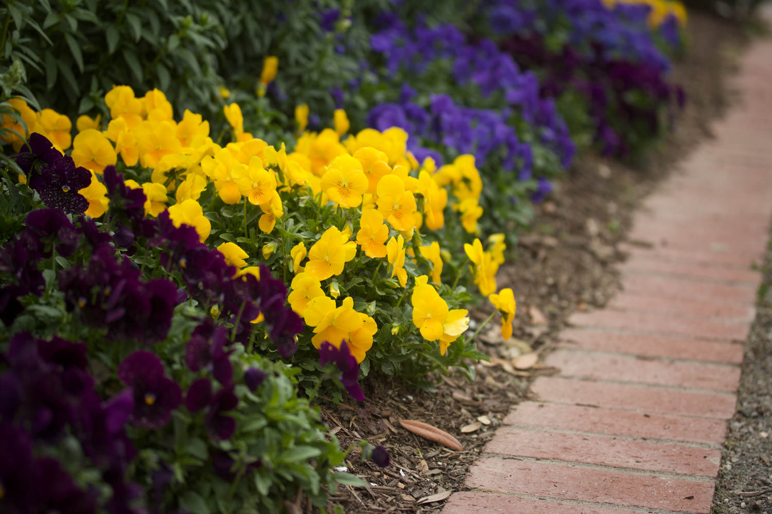
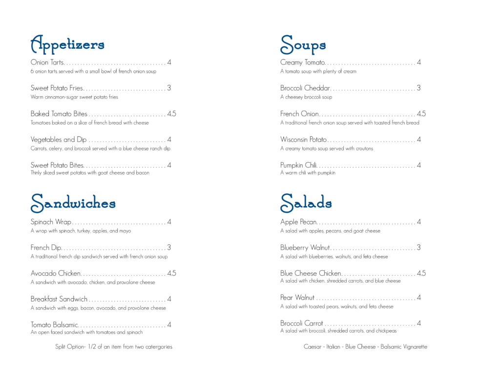
This menu is for a fictional restaurant called Bluebird. I chose to use blue as the main color as it connects to the name. The typeface for the headers adds interest to the menu, while also allowing it to remain simple so that everything can be clearly communicated with the focus on the menu items. The flowers on front are also simplistic, matching with the rest of the menu.
Ad Campaign
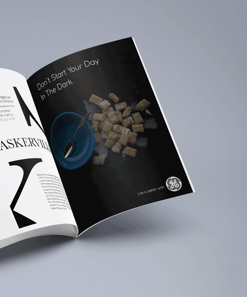
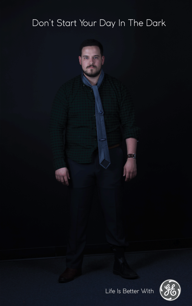
These are for an ad campaign idea for General Electric (GE). The idea was to portray in a comedic way what might happen if one were to get ready in the dark, or without proper lighting. Two ideas included cereal not in the bowl, and a businessman whose outfit is disheveled. This was done in collaboration with two others, and though there were some challenges when we had to work remotely due to COVID-19, it was really nice to work together with others, and we were able to come up with a fun concept for the campaign. I took the photos for the project.
Printables
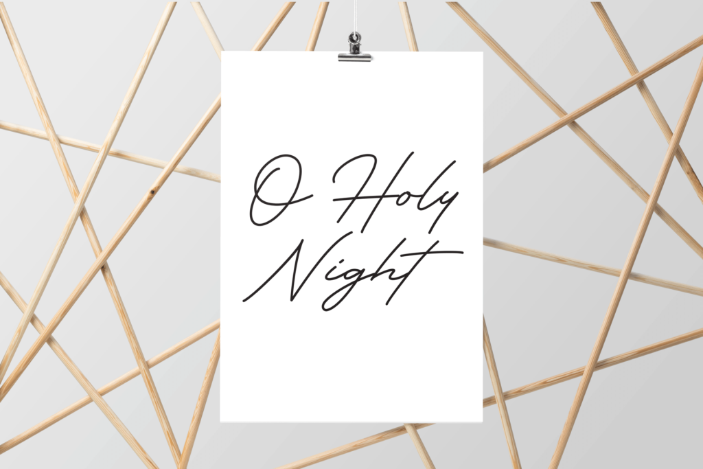
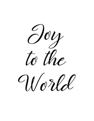
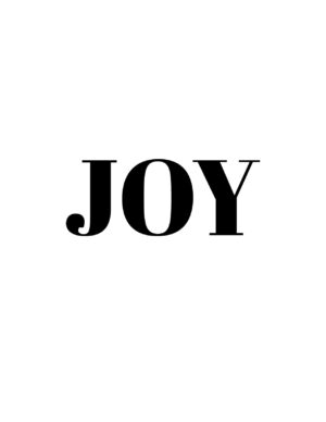
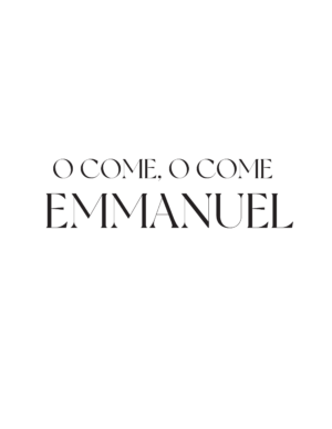
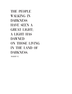
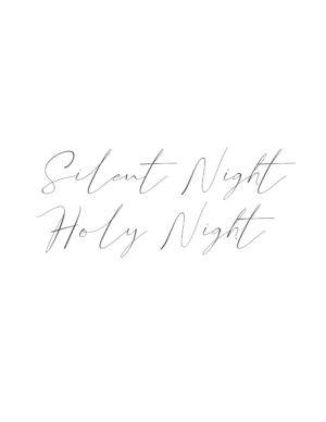
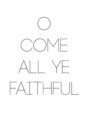
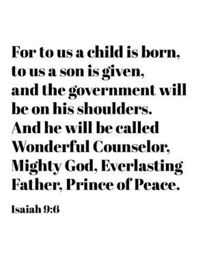
I designed some Christmas posters. I worked to arrange the type to fit with each text. I used several different typefaces for a varied look among the posters. I used titles from popular Christmas hymns for most of them, as well as some Bible verses related to Christmas. I kept all of them in black and white to allow more of the focus to be on the design and layout of the type.
These, and other verse prints can be found at my Etsy shop: Fleur Creative Co.
