Branding & Web Design
Happy Tails
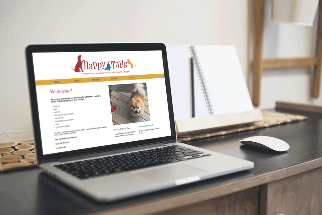
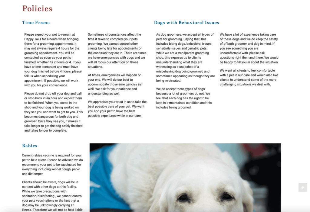
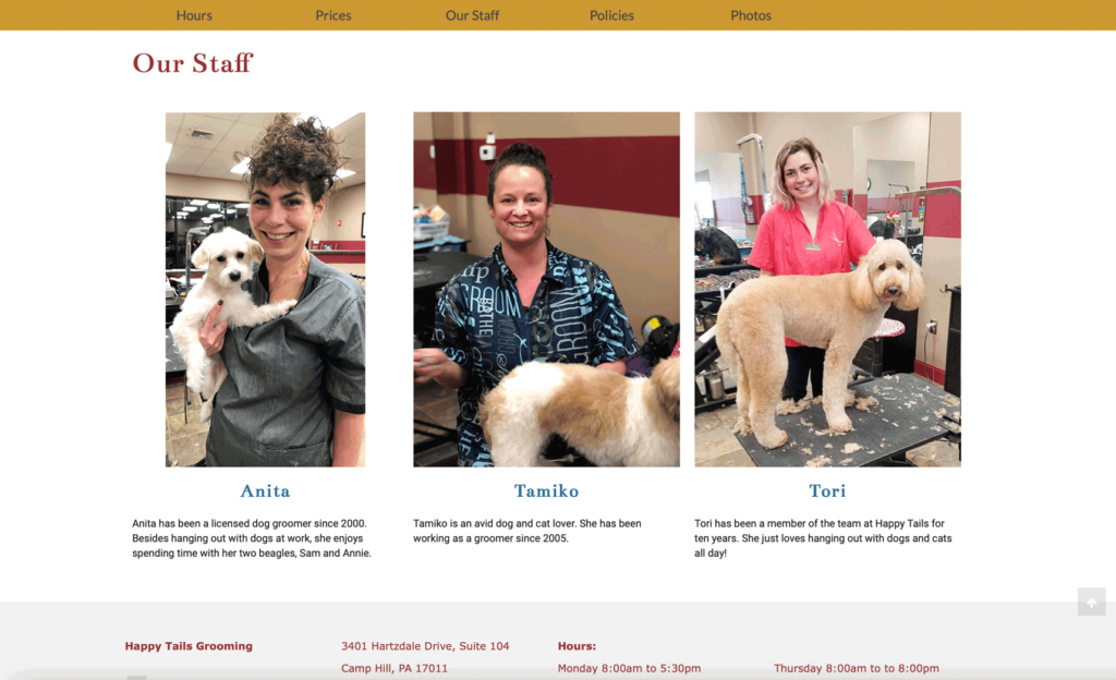
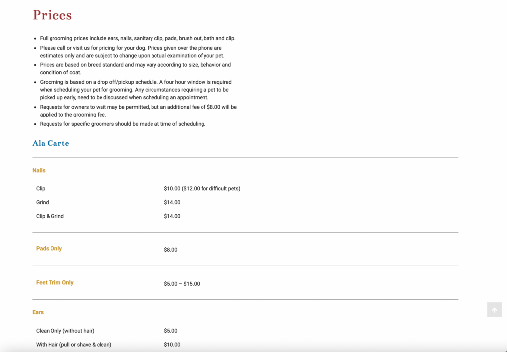
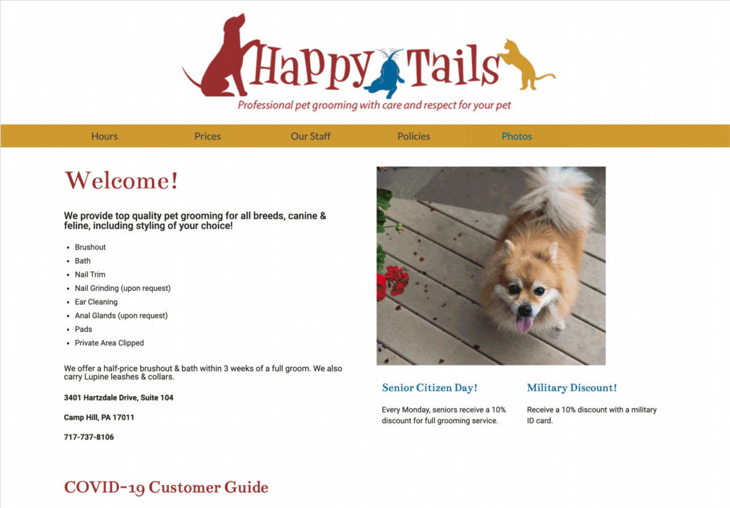
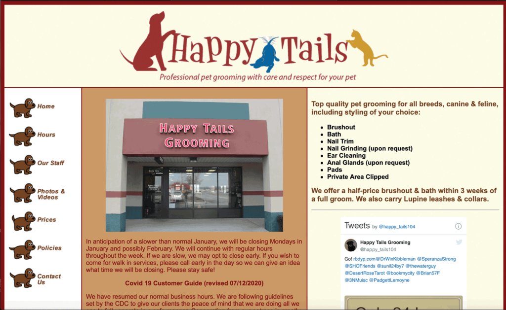
Happy Tails is a pet grooming service in Camp Hill, PA. I created an updated look for their website. I made it easier to read by increasing hierarchy and using a white background. To accomplish this, I made the headers larger, used a serif typeface and color from the logo for them. I also broke down some of the text into columns. I added some cute pictures of dogs as well to appeal to customers.
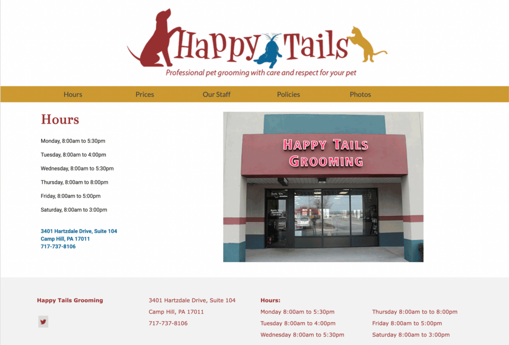
Original
G2 Silver
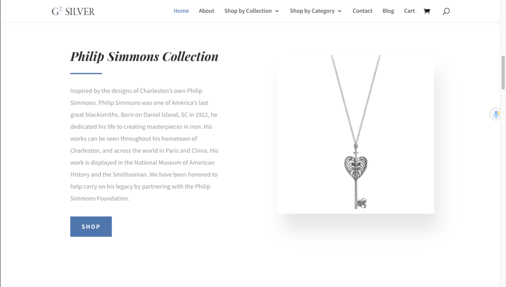
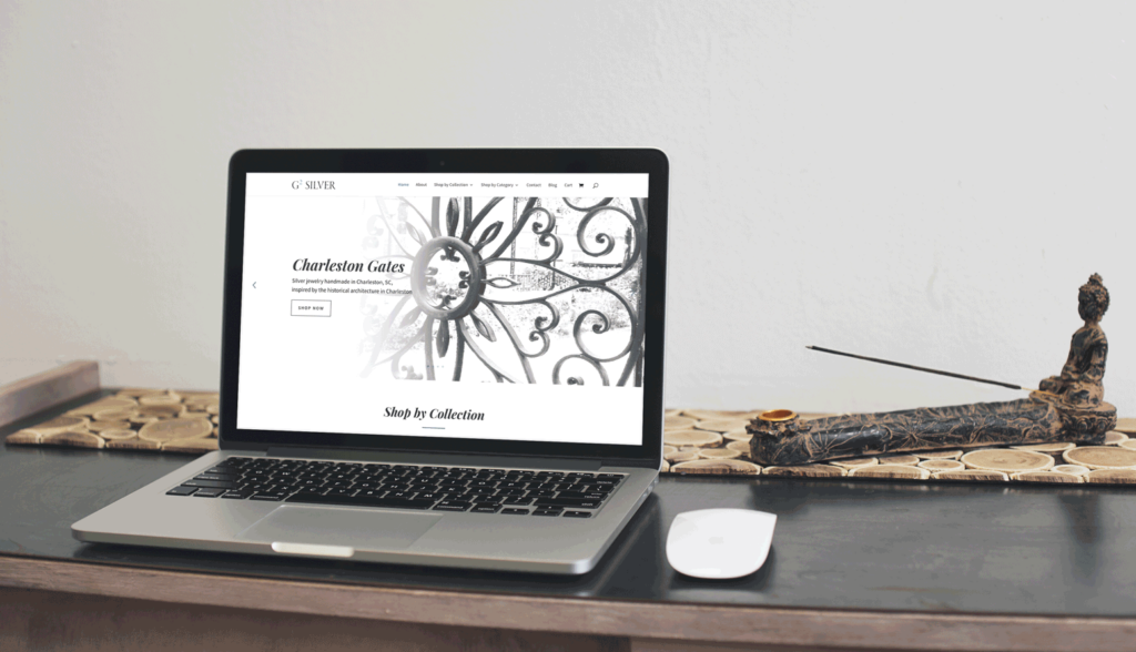
G2Silver is a jewelry company in Charleston, SC. I transferred data and updated their website. The header typeface is appealing and elegant, fitting with the brand’s jewelry, while the main typeface is a simple sans-serif to contrast with it. I used a blue similar to the blue in their logo to add a small pop of color.
Website: https://g2silver.com
Richland Shooters
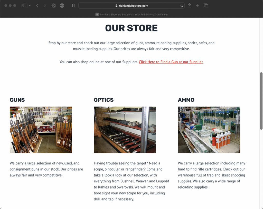
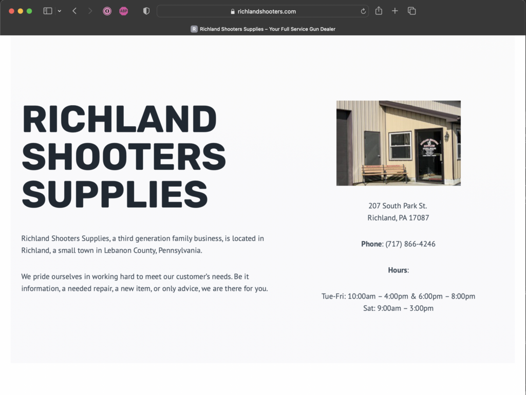
Richland Shooters is a small family business in Lebanon, PA. For this I created a a one-page website using the information from the old website, mainly updating it to look more modern. I kept it simple, laying out the information clearly.
Website: https://www.richlandshooters.com
Sandy Feet Software LLC Logo
I created a logo for Sandy Feet Software LLC, which specializes in systems for local tax collection. This logo features feet with a few gentle waves coming in, using negative space to keep it simple, but interesting. The blue is reminiscent of the color of the ocean, fitting with the beach theme.
Coastal Discovery Museum
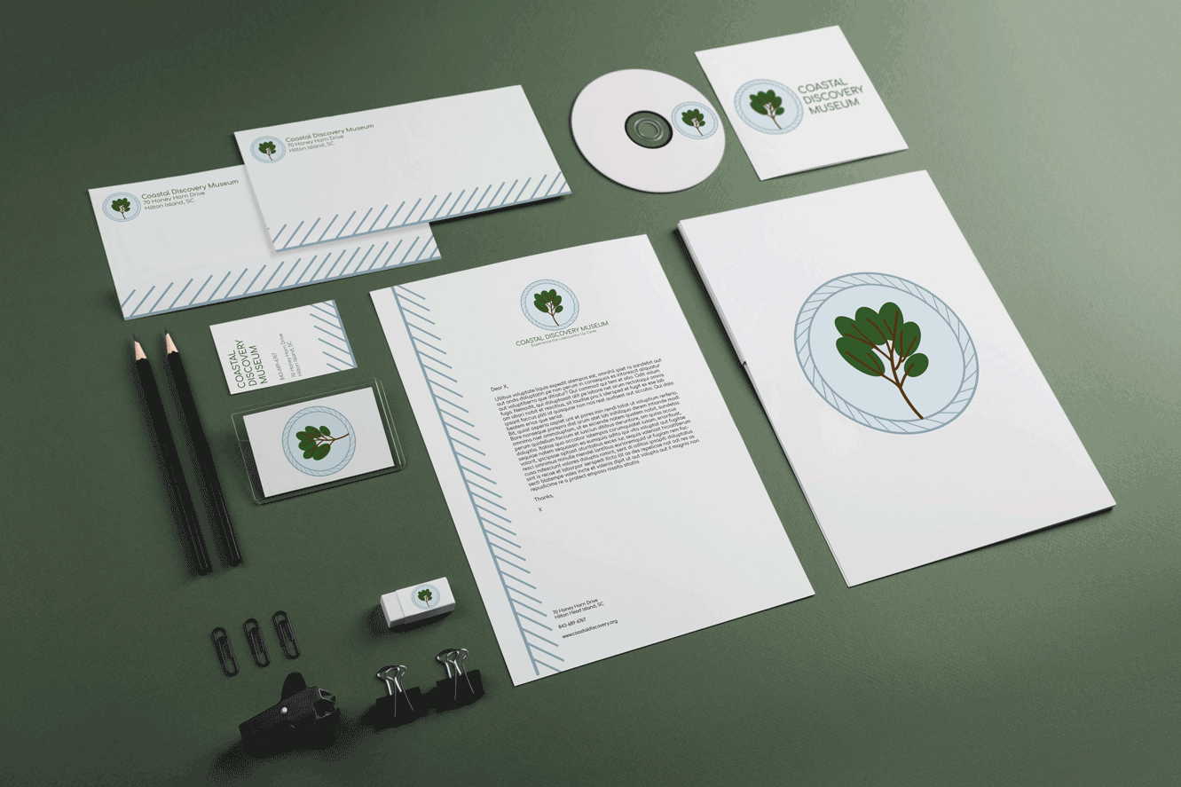
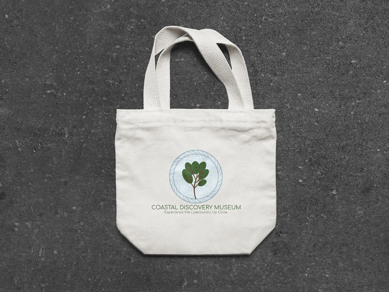
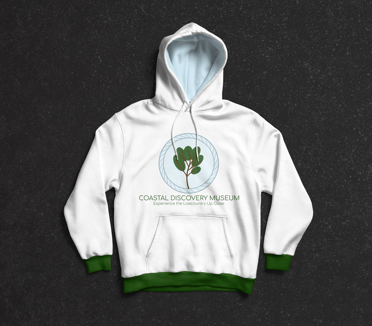
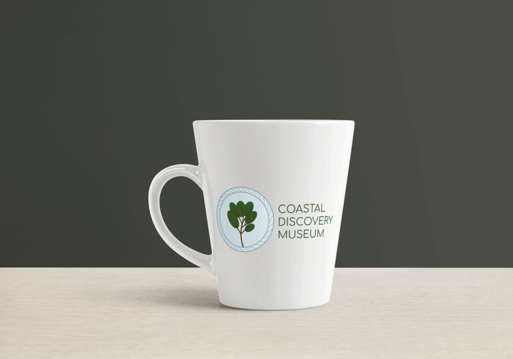
This logo is for the Coastal Discovery Museum, a museum in the South Carolina Lowcountry. I created a circular border inspired by sweetgrass baskets. Inside of it, I designed a tree, to give it a nature element like their original logo has. The simple sans-serif matches the logo and helps give it a modern feel. In addition to the logo, I also created some stationery to accompany it and mocked up some products that the museum might sell in its gift shop, such as a canvas bag or a hoodie.
Original:
Opa Cafe
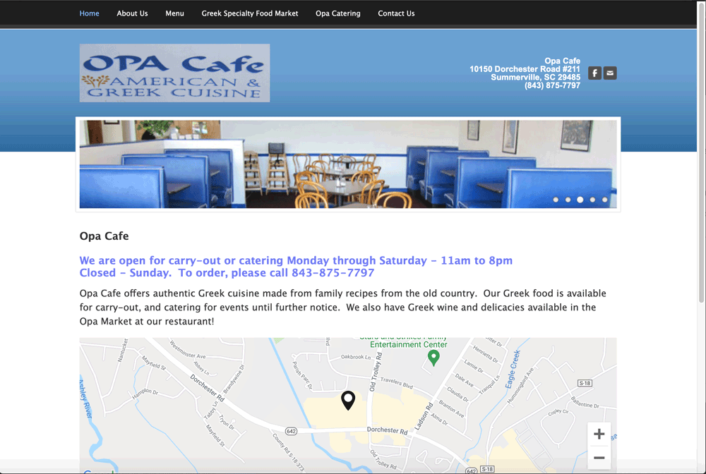
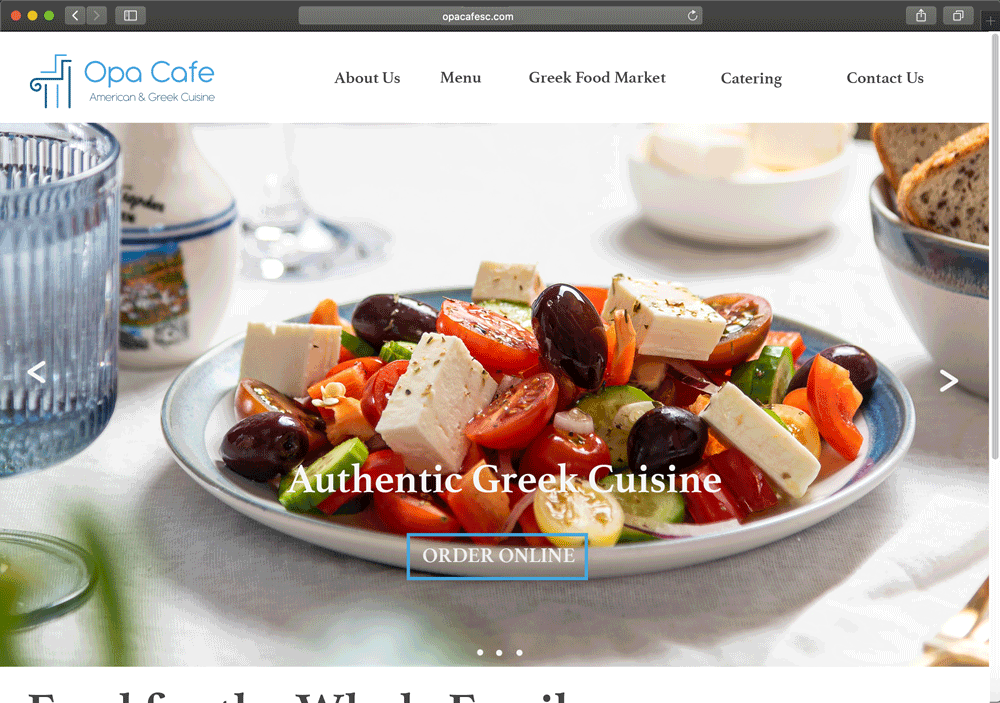
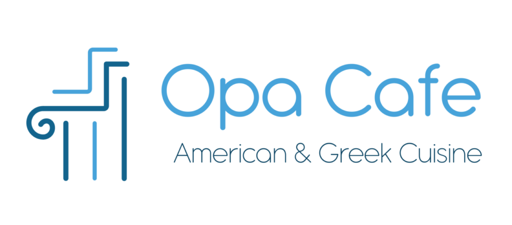
Opa Cafe is a restaurant in Summerville, SC that serves authentic Greek food. I created a new logo inspired by the look of Greek columns. I kept the colors similar to the blues of their original logo. The logo has gentle curves to it, and so I used a more rounded looking sans-serif with it. In addition to the logo, I mocked up what an updated website might look like. I put a picture of Greek food at the top to help draw customers in.
Original:
