Illustration
Book Cover
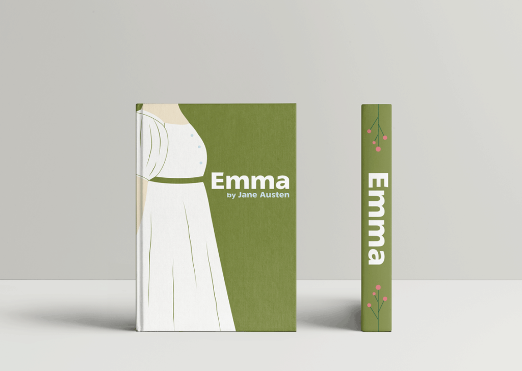
I made three different book covers for Emma by Jane Austen. In this novel, Emma, considering herself an excellent matchmaker after the marriage of her friend and former governess to Mr. Weston, sets out to find a match for her new friend Harriet Smith. Besides the disapproval from her close friend and brother-in-law, Mr. Knightley, Emma faces many challenges with the arrival of Mr. Frank Churchill and Miss Jane Fairfax, and suitors in Mr. Martin and Mr. Elton. In the ensuing mess and chaos, even Emma herself finds her heart entangled.
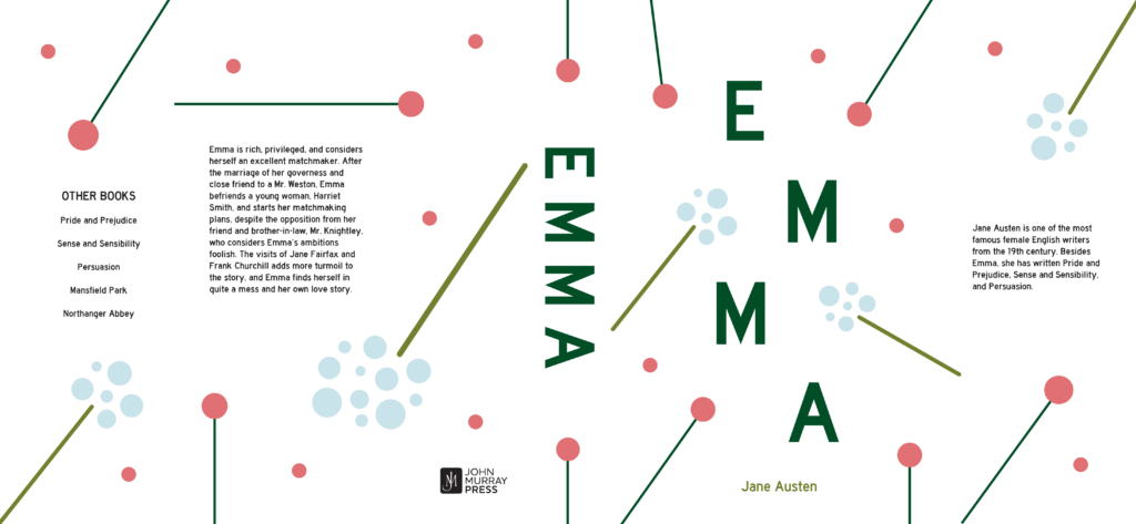
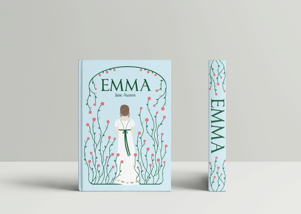
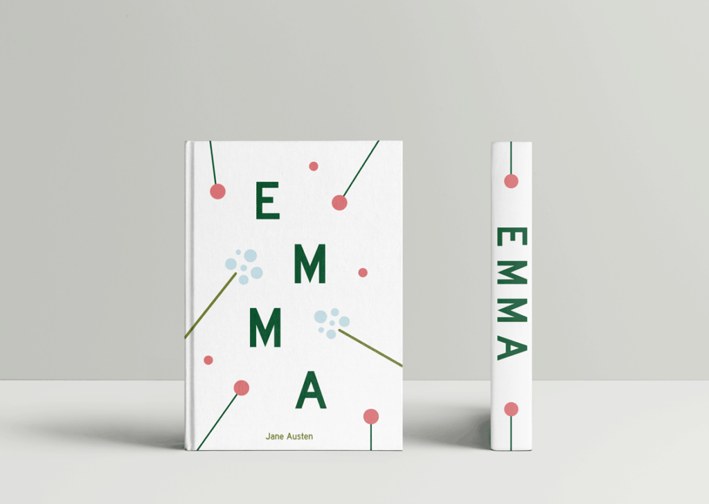
Each book cover is in a different art style: Art Nouveau, Plakastil, and Bauhaus. To help create a unifying look for the three of them, I worked with the same color palette. All four of them use the top four basic colors, which I chose so that I would have two flower colors, and two green colors to accompany them. The Art Nouveau uses three additional colors, for her hair and detail on her dress. I also used a flower motif throughout all three book covers. I wanted to create a feminine look, as it both fits well with the book and would appeal to the intended audience. The pink flower motif worked well for that.
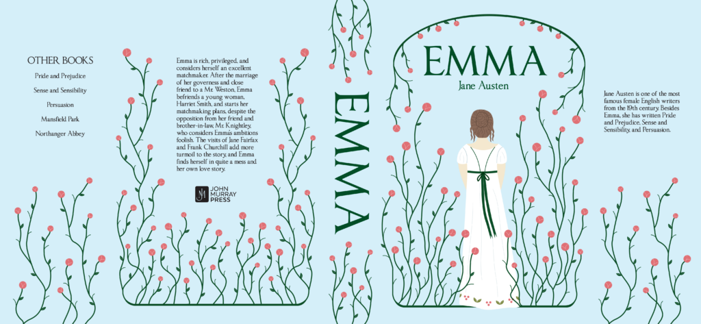
For the Art Nouveau, I went with a flowing look for the flowers, to fit with the art movement. The flowers are the most detailed on this one, with lines on the blooms and leaves, and the rest of the plant is curvy with little stalks coming off. I made the Plakastil flowers more geometric, with the stalks linear, and without the leaves and detail on the blooms, giving it a more simplified look. Finally, with the Bauhaus, I really focused on the flowers, using singular blooms positioned around. The text is a dark green to match the pink flower’s stem.
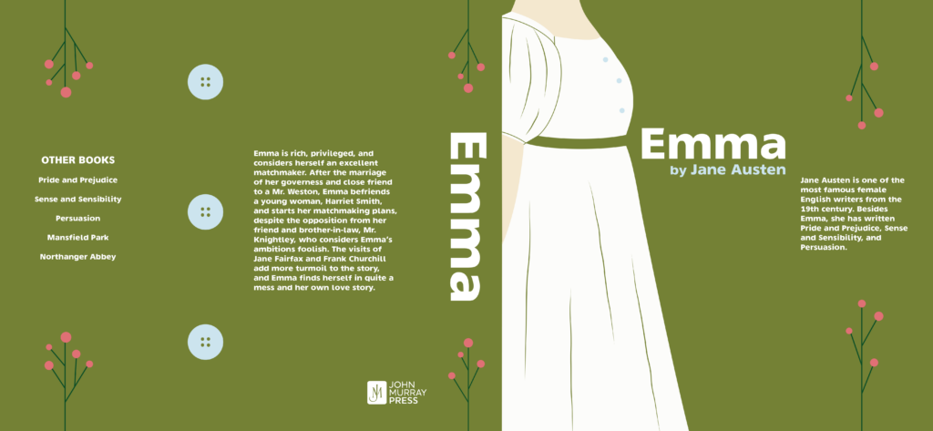
Art Nouveau
Plakastil
Bauhaus
Children's Book
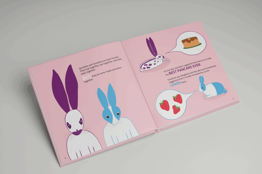
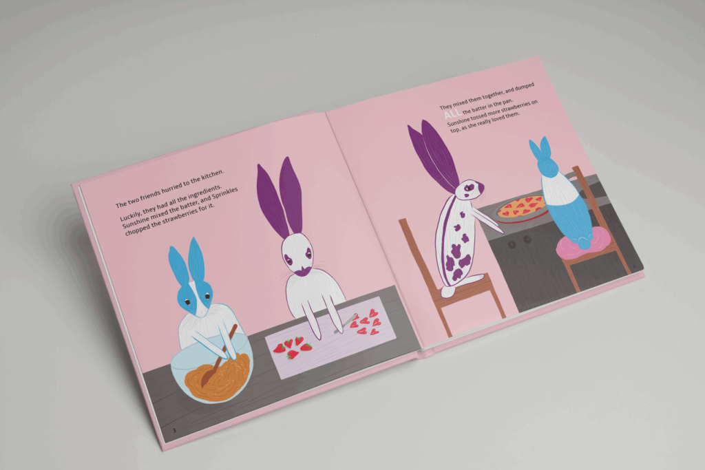
I illustrated and wrote part of a children’s book. This book tells the story of two rabbits, Sprinkles and Sunshine, who decide to make a strawberry pancake. I based the rabbits off of two of my family’s own rabbits, one being an English Spot, and the other a Dutch rabbit. English Spots have a unique marking, which allowed for a fun, memorable look to one of the rabbits. I chose more vibrant colors for the rabbits than is natural to make them more memorable and to give them more of a character. The addition of strawberries is both a fun element, and a tie in to the real rabbits, who both very much enjoy strawberries. I chose a light pink background to add contrast to the rabbits, who are white, as well as to give a fun pop of color.

Book Cover and Poster
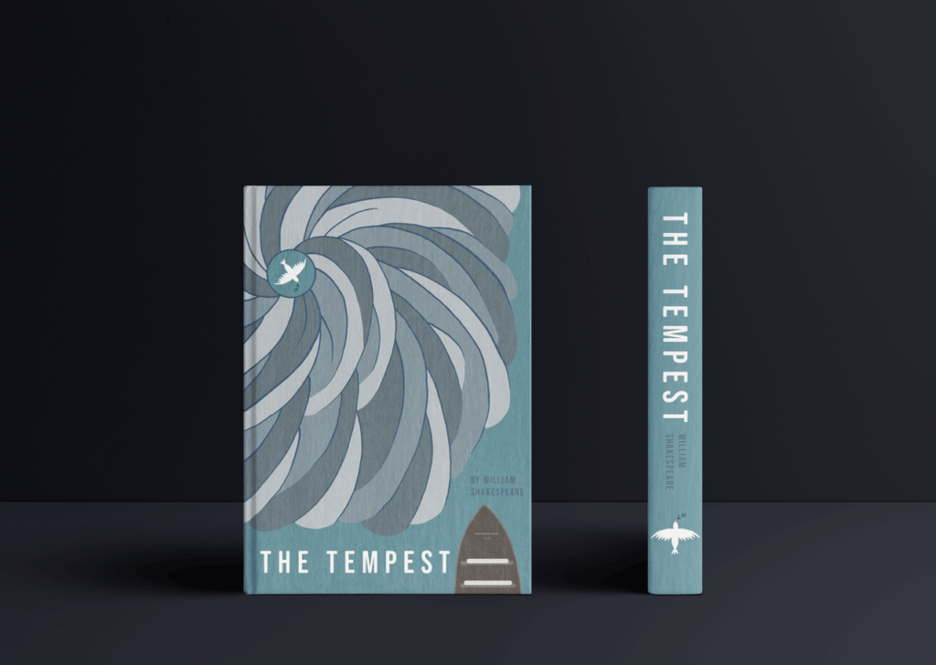
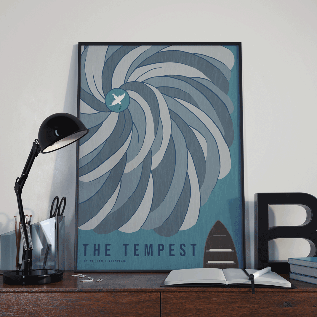
I designed both a poster and a book cover for The Tempest by William Shakespeare. The artwork depicts the storm that causes the shipwreck coming towards the ship, thus a scene from before the start of the play. In the middle of the storm flies a dove with an olive branch in its beak. This is to symbolize that the sending of the tempest is also a sending of forgiveness, as the events that follow the shipwreck lead to Prospero forgiving his brother, Antonio. For the storm, I was inspired by hurricanes, and this idea allowed for the dove with the olive branch to sit in the eye of the storm, fitting with the idea that even amid the storm, there is peace, as peace eventually comes to all the characters. I chose an overhead view of the storm to give it a more interesting, simplistic and modern style. I chose a less vibrant color palette to convey the stormy and moody aspect of it all, making the clouds gray. The dove is left white to stand out. The ship is left out of the storm so that it can be more clearly seen, with the dove pointing at it, indicating that the storm and the forgiveness are heading towards it. I added an overlay of a picture I took of the ocean to add texture to the image.
Poster and Social Media
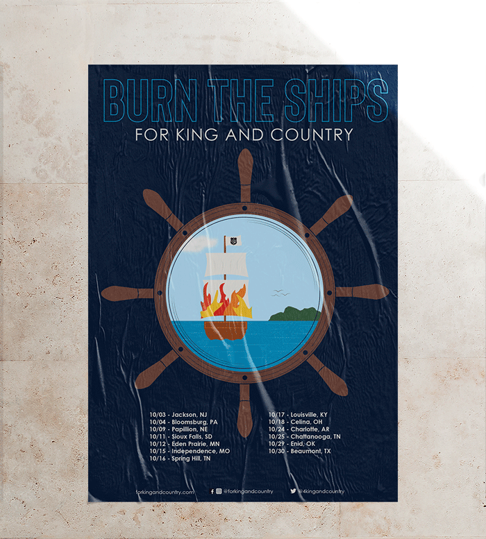
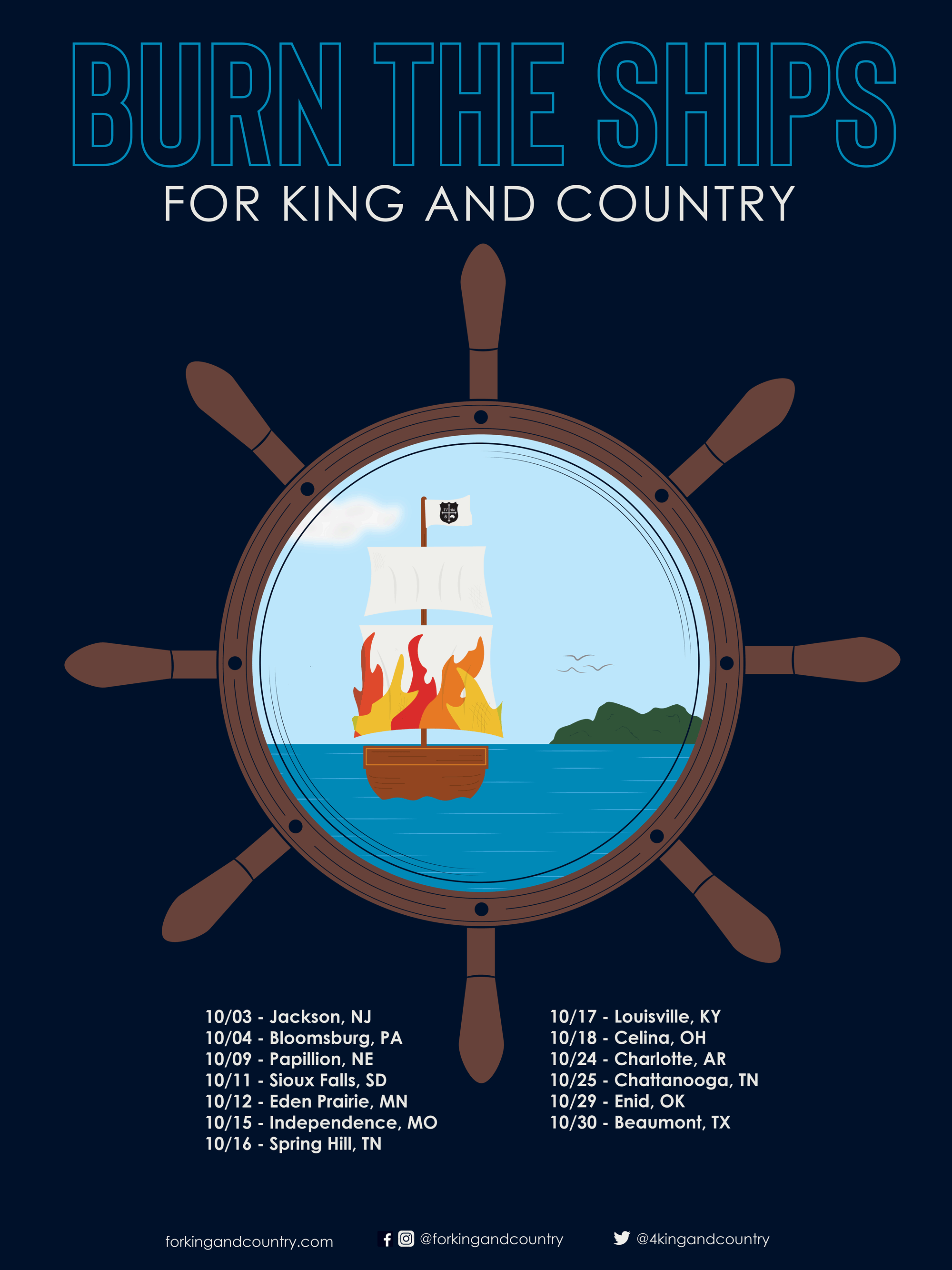
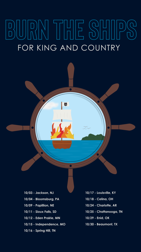
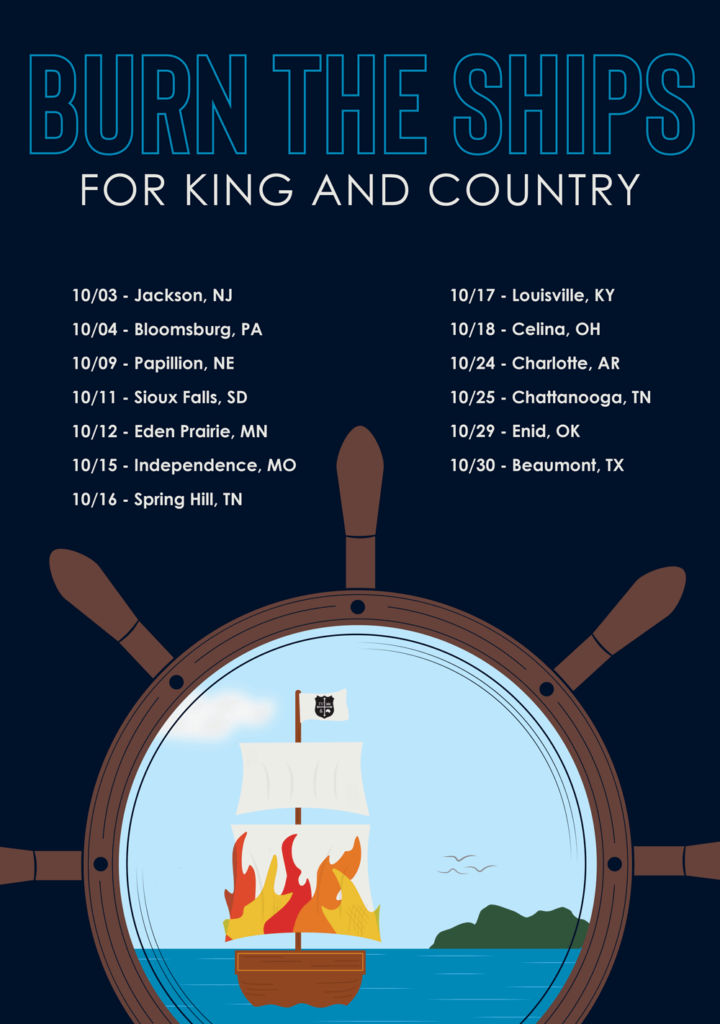
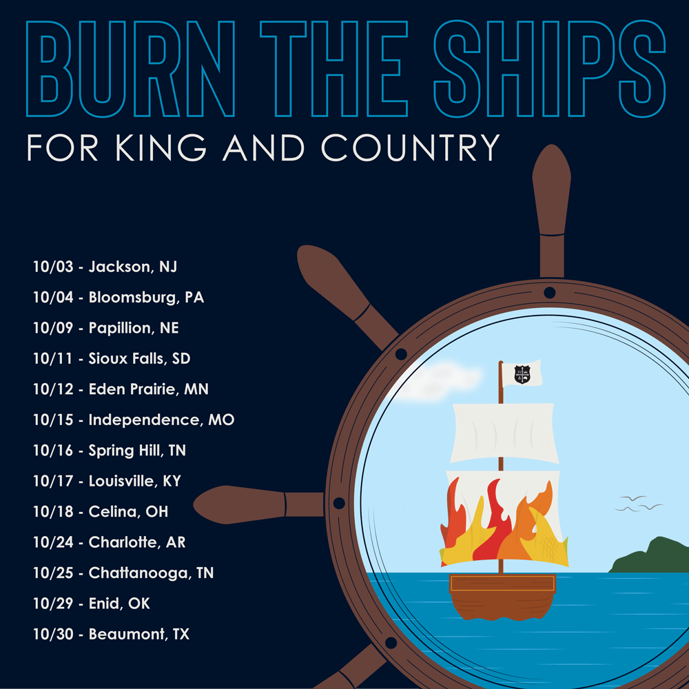
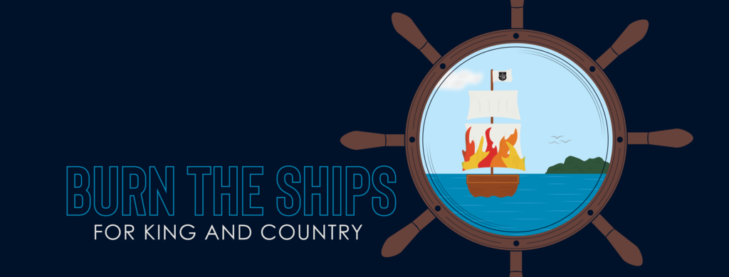
This is a music poster for the band, For King and Country, about their Burn the Ships tour. For King and Country is a Christian band with positive, uplifting songs. I created a digital illustration of a burning ship sailing away. The idea of the ship is surrounded by a ship’s helm, both framing it and giving the image that one is peering at it though a telescope or porthole. The ship’s flag contains the band’s logo. The birds and island add to the horizon line, helping to balance the image. The tour title is outlined, fitting with the detail lines used.
Social Media:
Cards
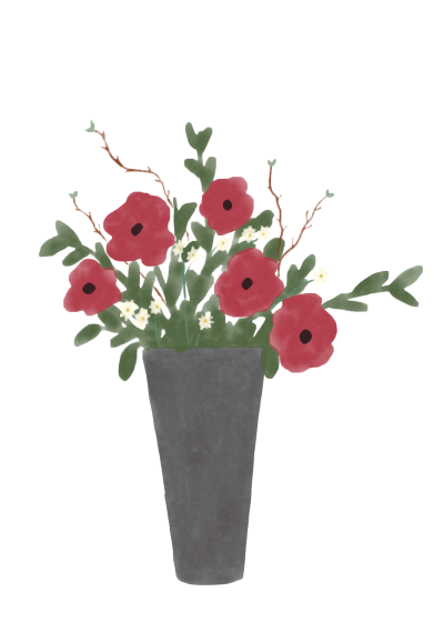
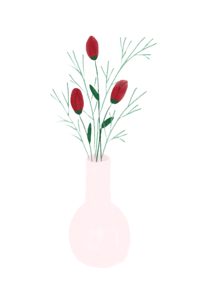
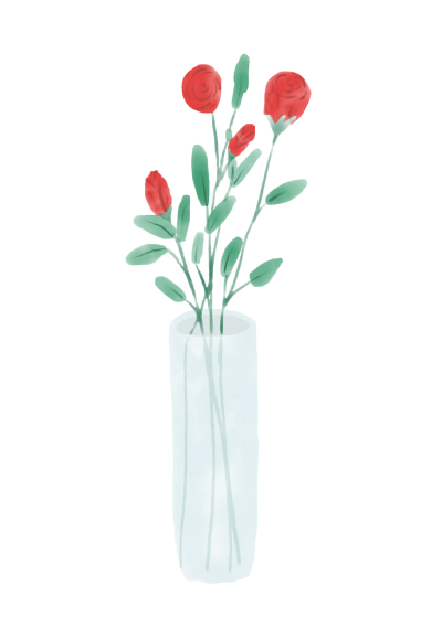
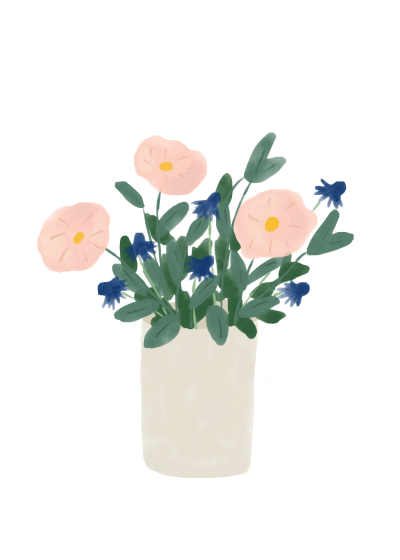
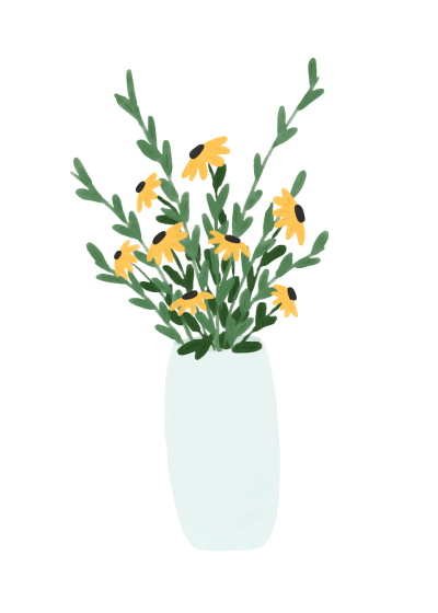
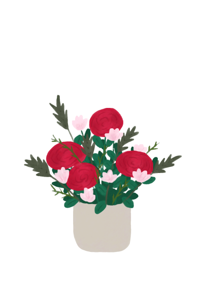
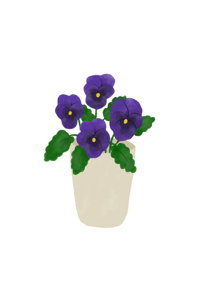
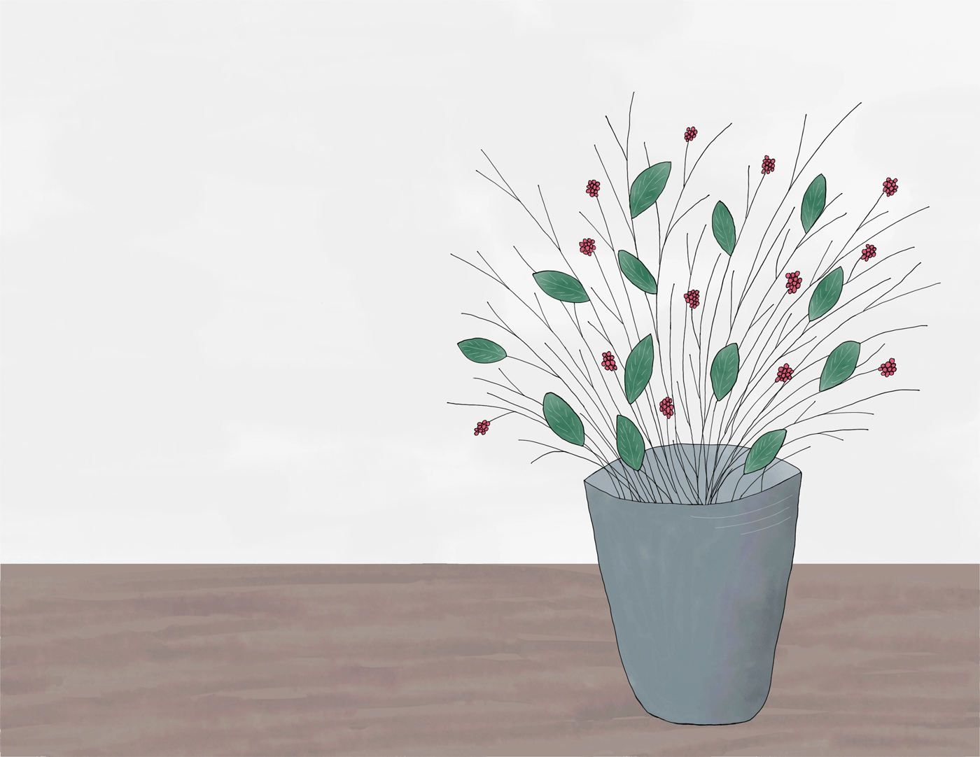
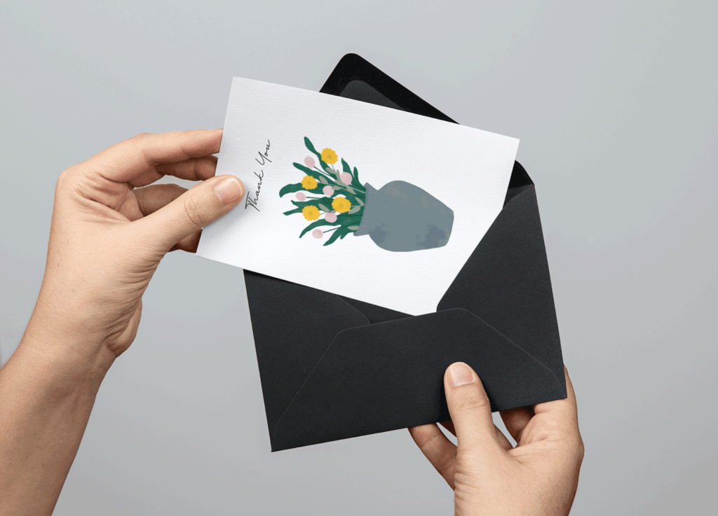
I created these simple watercolor flower illustrations and then turned them into thank you cards. Most of the flowers are real ones, like black-eyed susans, roses, and pansies, but I also took some creative liberties and simply based many of the flowers off of real ones. I kept the vases simple so that more of the focus would be on the flowers themselves.
Infographic for the Global Water Crisis

The global water crisis is a growing issue, as more and more people face the problems that unsafe water can bring. This infographic was made in accompaniment with a social awareness ad campaign. The textured image placed in the background is the same textured background that I used for the photos in the ad campaign. I chose a simple color scheme of three colors, with a darker blue and a light blue to connect to the theme of water, with a green to complement them. You can learn more about the global water crisis at watermission.org, worldvision.org, and who.int.
